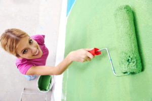
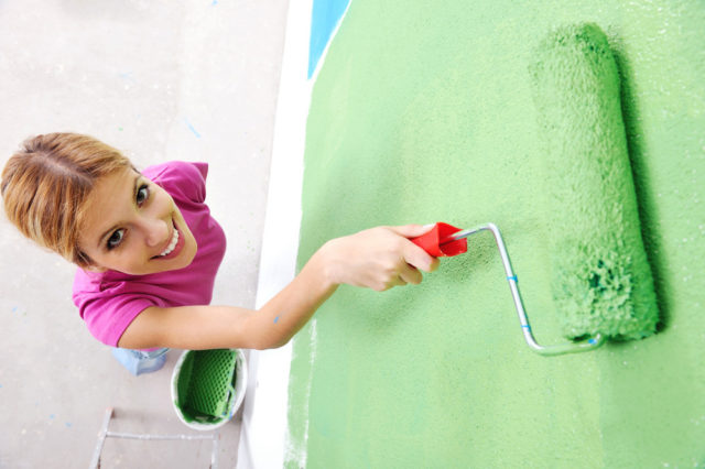
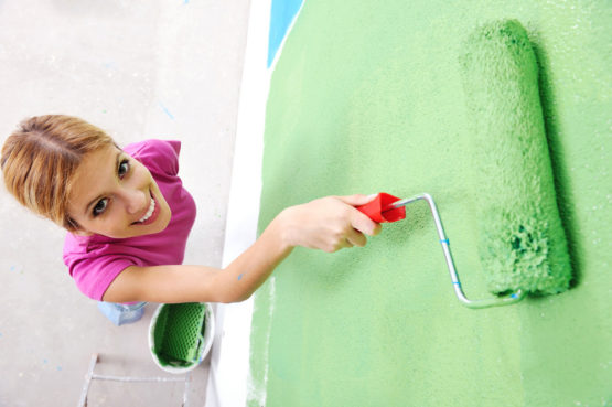
From Our Wallpaper Store to Your Walls: Wallpaper Trends in Colour and Texture
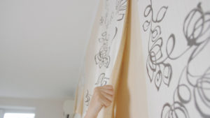
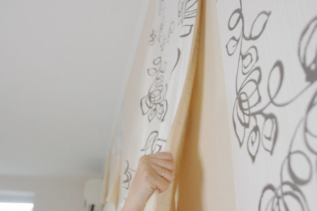
Wallpaper is making a quiet return and it’s not the glossy over-the-top version many remember. This year the shift is toward thoughtful, personal design. Patterns are being used like texture, not decoration. If you’ve been thinking about wallpaper but haven’t made the leap, this is a good time to explore the possibilities with guidance from a knowledgeable wallpaper store. Start with one wall, a powder room or the back of a bookcase. Small changes like these can shift the feel of a space without taking over.
Warm Neutrals Are Replacing Cool Greys
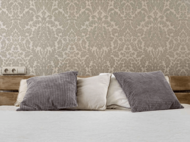
Cool grey has been a default for years but it’s starting to give way to warmer neutrals. Creams, soft sand, biscuit tones and greige with taupe undertones are showing up more often in wallpaper collections. These colours feel settled, not stark. They create comfort without washing out the space.
Wallpaper in these tones works best with a subtle pattern. Linework or a soft woven effect adds just enough interest without demanding attention. To keep the room cohesive, use a Benjamin Moore paint with similar warmth. For example, if your wallpaper leans creamy, avoid bright whites. A slightly off-white paint will support the wallpaper rather than competing with it.
Dark Colours That Feel Grounded Not Heavy
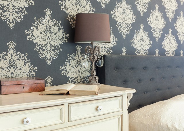
Deep shades aren’t leaving but they’re being used with more control. Instead of drama the goal is atmosphere. Charcoal, tobacco brown and near-black green are being used as backgrounds, not accents. These colours are appearing in matte finishes that absorb light and add depth.
Wallpaper in these tones works best when the rest of the room feels intentional. Clean trim lines, consistent ceiling colours and solid paint choices are important. Benjamin Moore offers several rich tones that don’t feel flat. They’re useful for creating subtle contrast without making the space feel busy. Matching the wallpaper exactly isn’t necessary. You want the colours to speak the same language not wear the same uniform.
Patterns That Leave Room to Breathe
Busy patterns can feel chaotic in larger or open spaces. That’s why bigger patterns are coming back but in a calmer way. You’ll see oversized botanicals, freeform geometrics and modern heritage motifs with plenty of negative space. These designs are bold but they don’t shout.
If the wallpaper has presence the rest of the room should step back. Choose wall colours that are soft and low-sheen. A washable matte finish helps the wallpaper feel grounded. Furniture, lighting and art should support the pattern not fight with it.
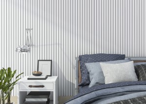
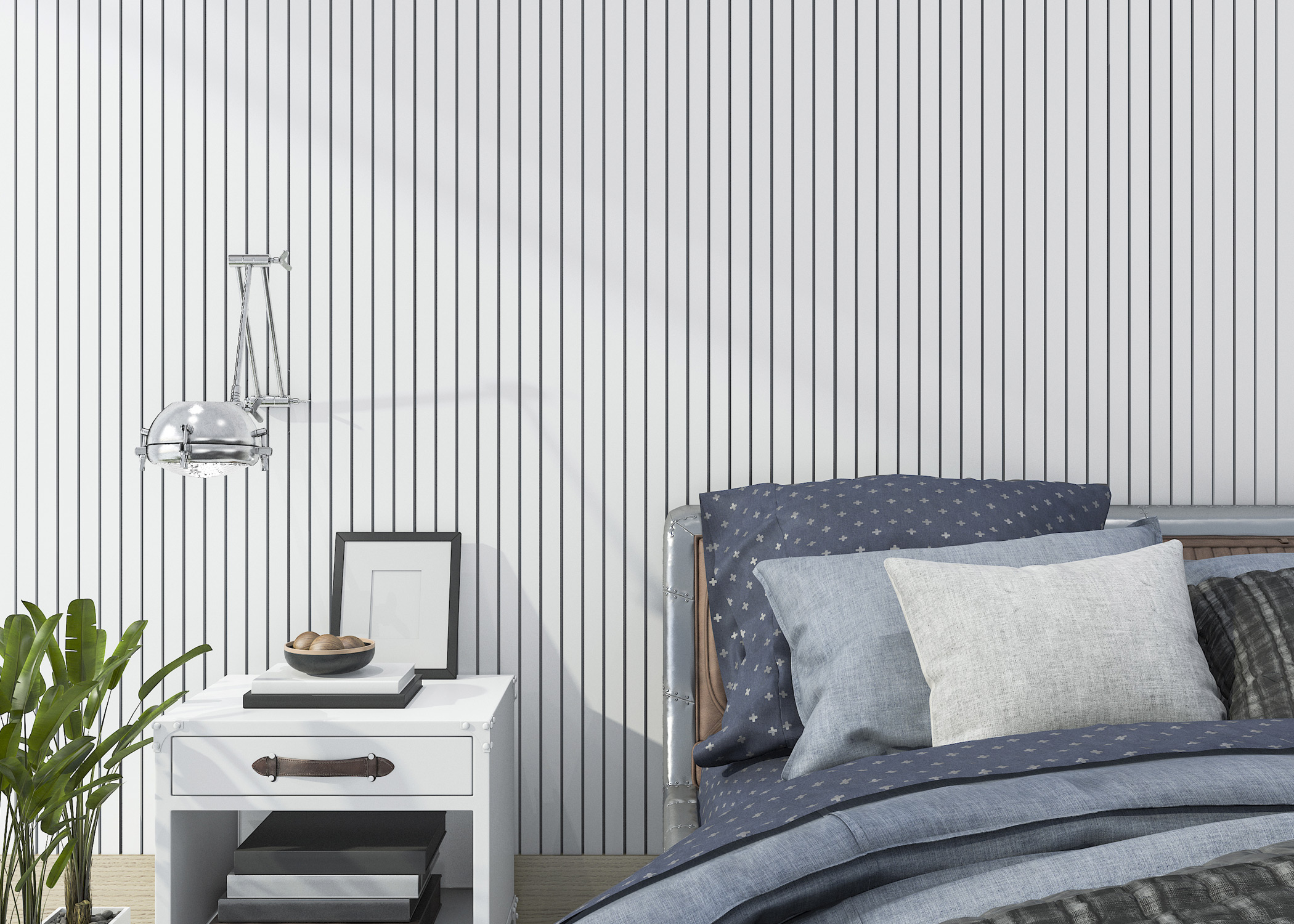
A New Take on Stripes
Stripes are returning but not in the rigid formal way of the past. The newer versions have an irregular hand-drawn quality. Many use low-contrast tones that create texture from a distance. These aren’t the stripes you grew up with. They’re warmer, quieter and more versatile.
Stripes can be used in less expected places. They work well in alcoves or inside built-ins. Try using them on the upper half of a wall with paint below. The paint colour can reflect one of the stripe tones helping the entire wall feel tied together. Benjamin Moore’s range of muted tones makes it easy to pull this off.
Texture Is the Headline
Of all this year’s trends, texture may be the most defining. Grasscloth effects, plaster-inspired finishes and linen looks are everywhere. Some papers are actually textured. Others just look the part under warm light.
These wallpapers bring dimension to bedrooms, dining rooms and home offices. They add softness without decoration. When using a textured paper keep nearby paint choices consistent. A single quiet neutral works better than jumping between colours. The goal is to let the wallpaper set the tone not compete with other elements.
How to Pair Wallpaper With Benjamin Moore Paint
Start with the undertones. Hold a wallpaper sample next to several swatches. Back up a few steps. The right paint will sharpen the wallpaper. The wrong one will dull it.
Then decide what you want the paint to do. If the wallpaper is loud the paint should calm things down. If the wallpaper is subtle use the paint to add presence. Benjamin Moore products give you options. Whether you need a low-lustre washable finish or something flatter for a formal space the right choice adds polish.
For rooms with trim or molding keep the finish consistent. High-gloss trim might work in a kitchen or bath. In living spaces a satin or eggshell usually feels better. When in doubt a good wallpaper store can help match products and finishes to the space.
Why Start at a Wallpaper Store
Choosing wallpaper isn’t always simple. You’re working with pattern, scale, texture and colour and trying to make it all work with lighting, flooring and furniture. That’s why visiting a wallpaper store can make the process easier. You get advice that’s specific to your home, not just general trends.
A good wallpaper store will also help you match your wallpaper to the right Benjamin Moore paint. That step is what makes a space feel pulled together not pieced together. You’re not looking for a perfect match. You’re looking for a relationship between the two.
Wallpaper trends, this year, feel less like a fashion and more like a direction. They offer options that suit a wider range of homes and styles. Whether you lean traditional or modern, soft or bold there’s a version that works for your space. If you’re ready to explore what wallpaper can do for your home, start with a visit to a local wallpaper store. You’ll walk away with real options and a clearer picture of what works for you. If you have questions or want a second opinion, get in touch with our team for friendly advice and in-store support.