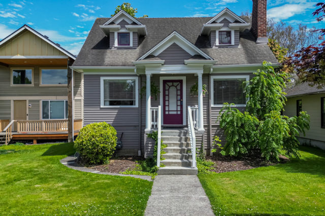
How to Choose the Right Paint Colours for Your Home at a Benjamin Moore Store
Choosing paint colours for your home can feel more frustrating than it needs to be. Colour affects how each room feels, how big it looks, and how well it connects to the rest of your space. What seems perfect on a screen or paint chip can look completely different once it’s on your wall. That’s where a visit to a Benjamin Moore store can help you make better choices and avoid expensive mistakes.
If you’re repainting one room or rethinking your whole house, you don’t have to follow trends. What matters most is how the colour works with your lighting, your furniture and how you actually use the space.
Start With How You Use the Room
Think about what each room is for before you choose a colour. Bedrooms should feel calm. Kitchens often work best with brighter shades that feel clean and fresh. Your living room might need something more flexible that shifts well with the light throughout the day.
Once you match a colour to the way you use a space, your choices become clearer. You’re not just picking what looks good in a photo. You’re choosing something that supports how you live.
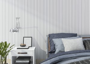
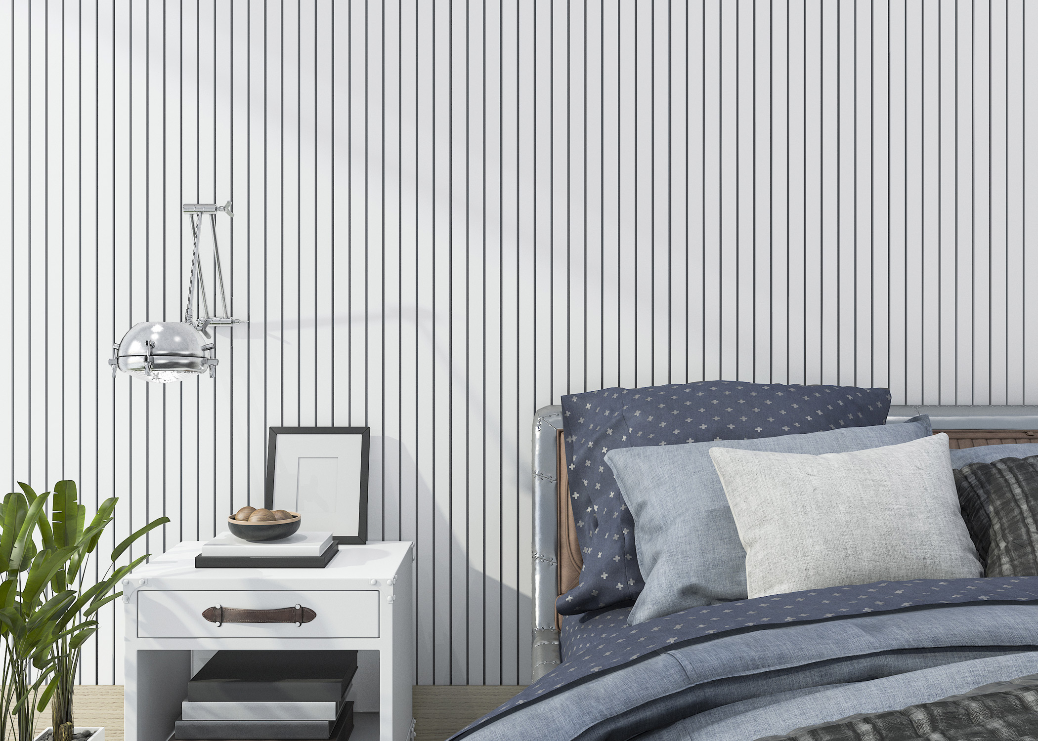
Pay Attention to Light
Natural and artificial light both affect how colour looks. A soft grey might feel cool in a north-facing room but warmer in a space that gets lots of sun. Light bulbs also play a role. LED lighting can shift the tone of a colour in ways that don’t show up on a paint chip.
This is why samples matter. Test a few options directly on your walls and look at them during the day and at night. At a Benjamin Moore store, you can find shades that respond well to your lighting conditions.
Create a Colour Flow That Feels Natural
You don’t need every room to match, but they should relate to each other. When colours share similar undertones, the transition from one space to the next feels easier. One way to keep things consistent is to choose a core neutral and build from there.
At a Benjamin Moore store, you’ll find curated palettes that help you see how different colours work together across your home.
Think Beyond Today
Paint colours should last longer than a season. Bold or trendy choices can be fun, but they may not age well or appeal to future buyers. If you’re thinking about resale, soft neutrals usually make a better impression. They let people focus on the space instead of the colour. According to No Vacancy, 63% of real estate agents recommend painting the interior walls of a home prior to selling. Neutral and widely appealing colours help buyers focus on the space itself rather than being distracted by bold or highly personal choices.
Even if you’re staying put, timeless colours reduce the need to repaint often. That saves you time and money over the years.
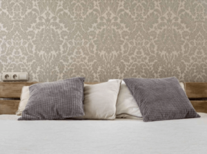
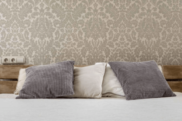
Don’t Skip the Details
Two colours that look almost identical on a card can feel completely different on your wall. That’s usually because of undertones. Whites especially can shift depending on what’s around them. One might feel too cold next to wood cabinets while another feels just right.
Accents also deserve some thought. A bold trim or feature wall works best when it ties into something else in the room like a rug or piece of art. If you want to try something bold, accents are a good place to experiment.
Get Advice You Can Trust
Choosing colours doesn’t have to be a guessing game. At True Colours Penticton, you’ll find helpful staff and tools that make the process easier. Whether you’re comparing undertones, testing samples or looking for something that works with your light and layout, they can help you choose with confidence.